
Investment Management Web App Redesign
Amino
Timeline
~2 weeks
My Role
Sole UI/UX Designer
Platform
B2B Web
AMINO Capital is a Palo Alto-based venture firm that invests in data-driven technology startups, including successful unicorns like Grail, Webflow, Weee!, Chime Bank, Rippling, and Dfinity. The previous internal investment management tool at Amino had poor usability, a steep learning curve, and lacked essential functions. As the sole designer on the project, I collaborated with a team of 5 Amino engineers and investment managers to launch a new and efficient management tool. The new tool significantly improves work efficiency for investment managers and streamlines their workflow.
Industry
Financial

Objective
To redesign Amino's internal investment/project management tool, improving its functionality, user experience, and visual design to streamline operations and enhance usability for B2B users.
UI/UX Audit
UI/UX audit has consisted of two parts. I played out usability scenarios from the perspective of the investment manager to better understand how the flows could be improved. The second part consisted of testing the website against common usability criteria and checking if it meets them. Guess what? It didn’t. 42 problems were identified, the main ones being:
Incoherent Information Structure:
No Hierarchy:
The company's list and detail pages lack a clear and logical flow.
Unoptimized Layout:
Old layouts consume excessive space and provide limited information.
Optimization can increase information display by 300% in a structured manner.
Confusing User Flows:
It is time-consuming and unintuitive to edit or comment on company information.
Outdated and Inconsistent Design Style:
The design style throughout the application feels outdated and lacks consistency, impacting the user experience.
Challenges
Understand Complex Business Logic
Learn complicated business logic Firstly, as a business-to-business (B2B) tool, I needed to swiftly grasp the intricate business logic and workflows of investment managers. This involved acquiring a solid understanding of financial and funding knowledge, as well as investment practices, within a limited timeframe.
Timely and Smooth Tool Launch in a Tight Schedule
We aimed to publish the new tool online within a tight timeframe. After delivering the designs, I closely collaborated with the Amino team and completed 3 rounds of UI/UX tests to make sure that all design implements the correct way. In the end, Investment managers seamlessly transitioned to the new tool and experience a significantly improved user experience.
Solutions
We devised a modern and comprehensive platform that streamlines and enhances the investment management process for our investment managers. This powerful tool combines a wide range of functionalities to effectively manage company portfolios, facilitate investment decisions, oversee funds, and foster seamless communication with investors and target companies.


UI Upgrade


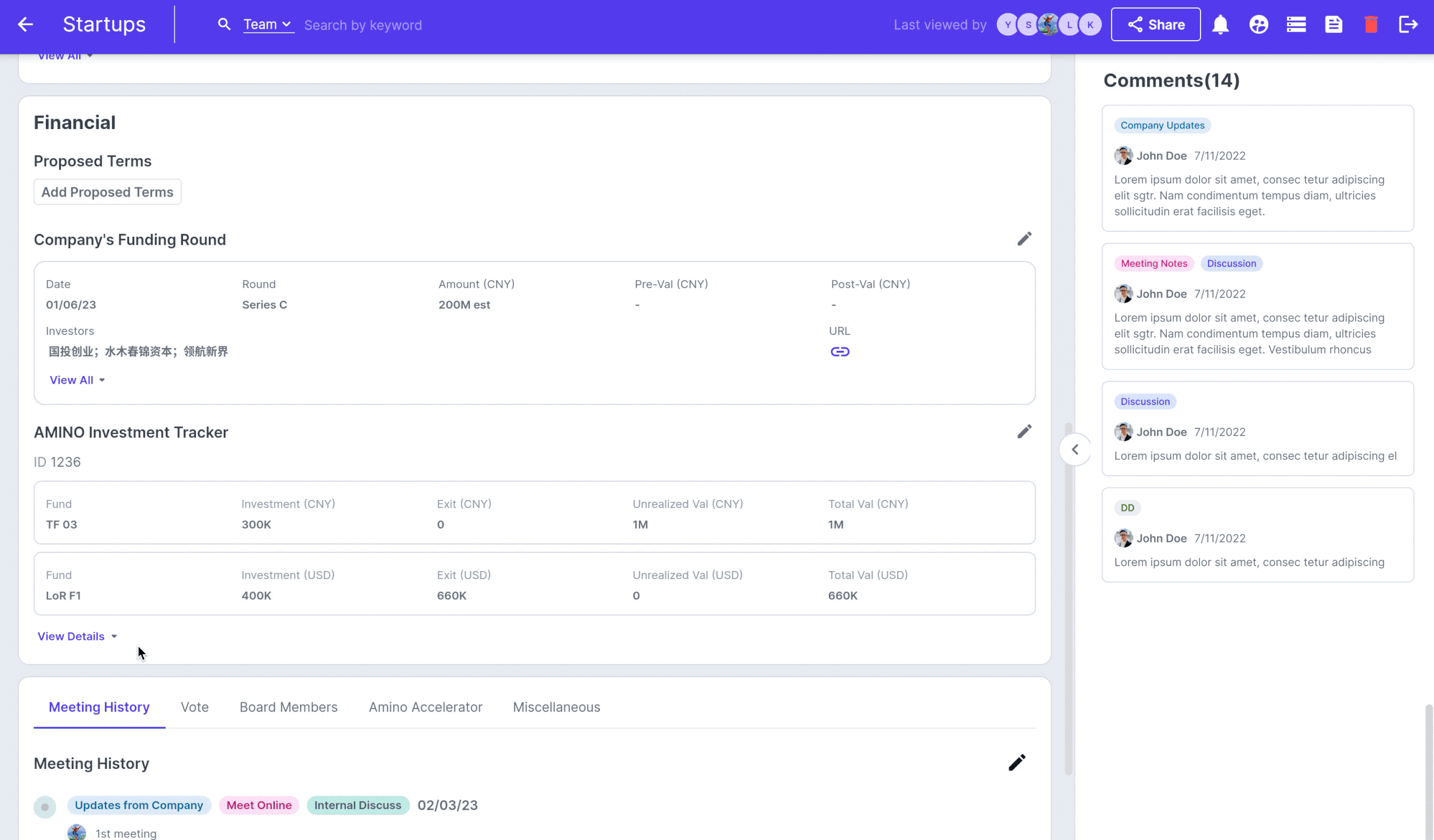
Optimize Information Architecture

User Testing
Participants: 10 internal employees who use the internal financial tool daily
Method: a moderated remote usability study
Preparation: a prototype and survey questions
Based on the results obtained from the user testing, the final layout for the company detail page was determined.
Card Sorting
invited six investing managers to organize and prioritize information into distinct categories
The input served as a valuable foundation for creating an intuitive and user-friendly company detail page layout.


VC Capital Competitive Analysis
Analyzed over eight venture capital competitors, including Crunchbase, VC4A, and Rhino Data, to study their layout designs.
Examined the advantages and disadvantages of each layout and evaluated them using UX design success metrics such as increased reading/editing efficiency and reduced user effort.
Narrowed down the options to three based on the analysis results.

Optimize User Experience
Flexible Layout Customization
Flexible Expand
With flexible sizing options for the company information and comment sections, users can adjust the ratio to meet their specific needs.
For investment managers, a 1:3 layout prioritizes comments, providing an enhanced commenting experience. Executives or bosses can opt for a balanced 1:1 layout to view both comments and company information simultaneously. In cases where comments aren't relevant, a 3:1 layout lets users focus on the information without distractions.

By incorporating the Flexible Expand feature, we have prioritized user needs and provided a user-friendly approach to navigating and extracting relevant information. This level of customization promotes efficiency and empowers users to uncover deeper insights, ultimately enhancing the overall user experience on the company detail page.


Clients Review
"It's a pleasure to work with Yuhan. She is responsible, reliable, patient, and professional. She worked part-time for us, devoting great effort to our project, and sometimes I felt like I was working with a full-time colleague. I will definitely turn to Yuhan again if I need a UI designer in the future."
—— Amino Investment Manager, Yiqian Feng